
— JOURNAL
19 June 2026 · Week 3 — Figma Basics
Learning the Basics of Figma
PROJECT DOCUMENTATION
Getting familiar with Figma's core tools, frames, layouts, wireframes, and basic visual design.
This week I stepped back from building and spent most of my time planning. The site was starting to grow in a few different directions and I wanted to slow down, look at it as a whole, and make sure every page had a clear reason to exist. The aim was to plan every page out, sketch some home page directions, and get clearer on the visual identity before pushing further on the build.
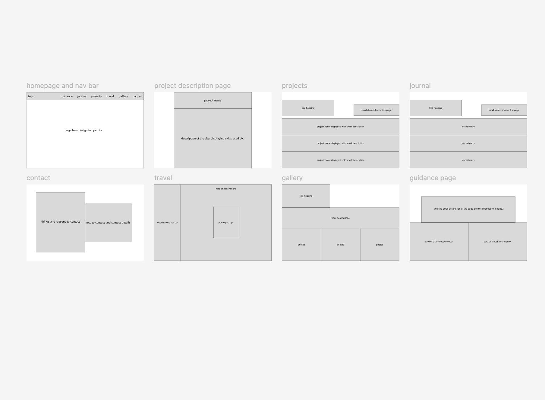
I started with wireframes. I mapped out the homepage and nav bar, project listing page, project description page, journal listing, contact, travel, gallery and the guidance page. Sketching these out properly made it easier to see how the pages connect and where the layout patterns can repeat. The projects and journal pages share the same row-based archive feel. Travel and gallery both lean on images. Guidance is a grid of company cards. Having one page of wireframes side by side made the whole structure feel more deliberate instead of a stack of separate ideas.
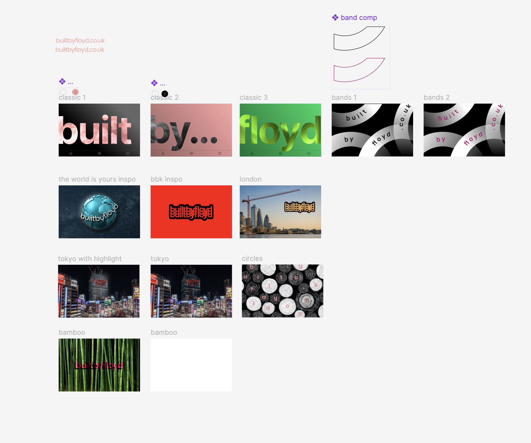
After the wireframes I moved onto the home page. The home page has been the part I have struggled with most because it has to set the tone for the whole site without saying too much. I tested a few directions in Figma — large editorial type with one word per frame, photographic hero treatments using London, Tokyo and bamboo as backdrops, repeating sticker logos on a flat colour, and a more abstract bands and circles direction. None of them are final, but lining them up next to each other made it obvious which ones actually feel like Built by Floyd and which ones felt borrowed from somewhere else.
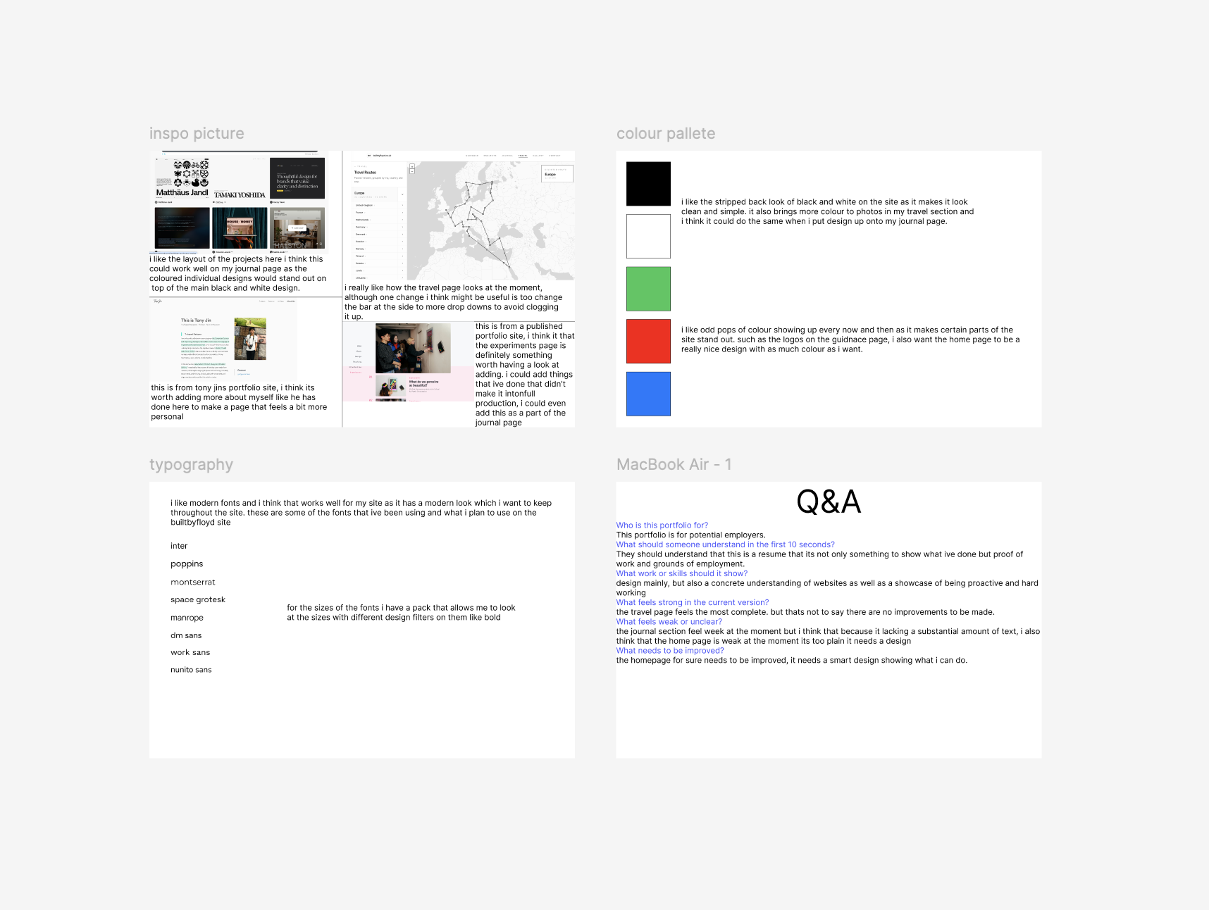
Alongside the home page experiments I put together a small inspiration board. I pulled in references I keep coming back to — Matthäus Jandl, Tamaki Yoshida, Tony Jin's portfolio — plus a screenshot of my own travel page because it is the part of the site I feel most settled on. I locked in a black and white base with small pops of colour for moments like the guidance logos or photography on travel. I also shortlisted the type — Inter, Poppins, Montserrat, Space Grotesk, Manrope, DM Sans, Work Sans, Nunito Sans — and finished the board with a short Q&A about who the site is for and what it needs to prove. Writing that out made it easier to judge whether a design idea was actually doing its job.
The biggest thing I took from this week is that planning is part of the work, not a delay to it. Sketching out every page, testing home page directions side by side, and writing a short Q&A about the site forced me to be honest about what is strong, what is weak, and what still needs design effort. The travel page is the closest to finished. The home page is the weakest and needs the most work. The journal needs more entries before it feels real. Next week I want to take the strongest home page direction from these experiments and start building a proper first pass of it in the site.
Key takeaways
- 01
Planning is part of the work. A clear set of wireframes makes the build much faster and stops the site drifting page by page.
- 02
Testing directions side by side is the fastest way to choose. Lining the home page concepts up next to each other made the right one obvious.
- 03
A black and white base with small pops of colour keeps the site calm but stops it feeling flat. Photos and brand marks become the colour.
- 04
A short Q&A about who the site is for and what it needs to prove is a useful filter for every design decision after it.