
— JOURNAL
27 July 2026 · The Daiquiri Club
Building The Daiquiri Club Website
PROJECT DOCUMENTATION
A full website build for an events brand specialising in frozen cocktails, pop-ups and festival appearances — bold, energetic and responsive across every device.
Recently, I have been working on a full website build for The Daiquiri Club, an events brand specialising in frozen cocktails, pop-ups and festival appearances.
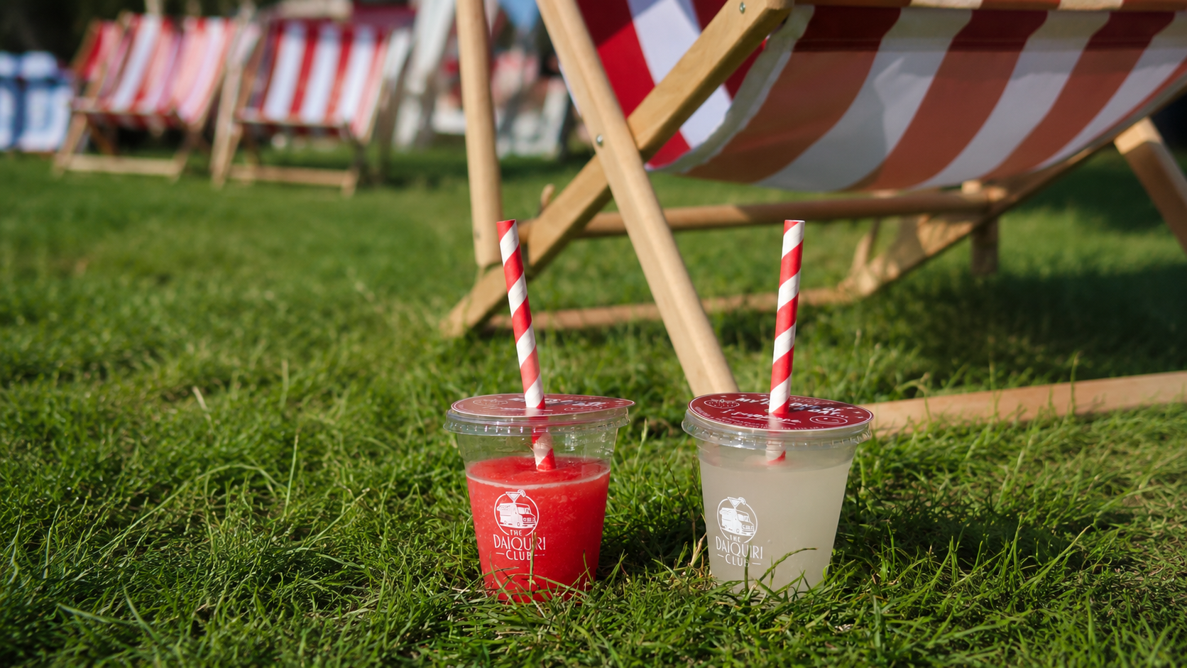
The main aim was to create a website that felt fun, bold and energetic while still looking clean and professional. I worked with the brand's red-and-white visual identity and used large imagery, video and strong typography to make the site feel more immersive. A big part of the process was making sure the personality of the brand came through without the design becoming too busy.
I built several key pages, including the homepage, gallery, packages, merchandise, calendar, pop-ups and contact page. I also created individual product pages for the merchandise and developed an events calendar that clearly separates upcoming and previous events.
One of the biggest challenges was the mobile version of the website. I spent time improving the full-screen hero sections, navigation, video playback and transitions between content. Autoplay video on iPhones caused several issues, so I experimented with different solutions to make the experience feel smoother and more reliable across Safari and other mobile browsers.
Throughout the build, I also carried out regular UI checks across desktop, tablet and mobile. This involved refining spacing, typography, image positioning, button sizes and scroll behaviour. I worked on making the transitions between videos and images feel seamless and removed visual flashes that made the site feel less polished.
This project has helped me improve my understanding of responsive web design and how a website needs to adapt across different devices. It also showed me how important testing and small design adjustments are when trying to turn a strong visual idea into a functional website.
Key takeaways
- 01
A strong brand identity guides every design decision. Red-and-white, bold type and large media kept the site feeling like The Daiquiri Club.
- 02
Mobile needs its own attention. Full-screen heroes, autoplay video and transitions all behave differently on iPhone Safari.
- 03
Regular UI checks across devices matter. Small refinements to spacing, buttons and scroll behaviour add up to a more polished feel.
- 04
Video and imagery need careful handling. Removing flashes and smoothing transitions made the site feel much more considered.
- 05
Responsive design is a process, not a setting. Each page needed real testing across desktop, tablet and mobile.